
You’ve finally decided to repaint. You open the paint fan deck at the hardware store, and two hours later you’re still standing there, paralyzed by 3,000 shades of white. Sound familiar? You’re not alone — choosing paint colors is one of the most stressful decisions homeowners face, and one of the most permanent. Get it wrong and you’re living with it for a decade.
After completing hundreds of interior painting projects across Seattle, Bellevue, Kirkland, and the surrounding area, our team at Paint Gunners has developed a repeatable, stress-free process for choosing colors that clients love — every time. This guide walks you through it step by step.
Why Choosing Paint Colors Feels So Hard
The difficulty isn’t a lack of options — it’s an excess of them. Most major paint brands offer between 1,500 and 3,500 colors, and color chips under fluorescent store lighting look nothing like they will in your home. Add in the pressure of permanence and cost, and it’s no wonder people freeze.
The other problem is that most homeowners start in the wrong place. They look at color chips first, before understanding what their home’s fixed elements actually require. That’s like choosing an outfit before you know what shoes you’re wearing.
Step 1: Inventory Your Fixed Elements
Before you open a single paint chip, photograph every element in the room that you cannot change: hardwood or tile flooring, countertops and backsplash, built-in cabinetry, brick or stone fireplace, furniture you love and plan to keep. These are your anchors. Your paint palette exists to complement them, not compete.
Look at these photos under your home’s actual light — morning, afternoon, and evening. Note the dominant undertone you see. Are your floors warm and honey-toned? Cool gray? Does your tile have pink or blue in it? Your paint colors need to share those undertones.
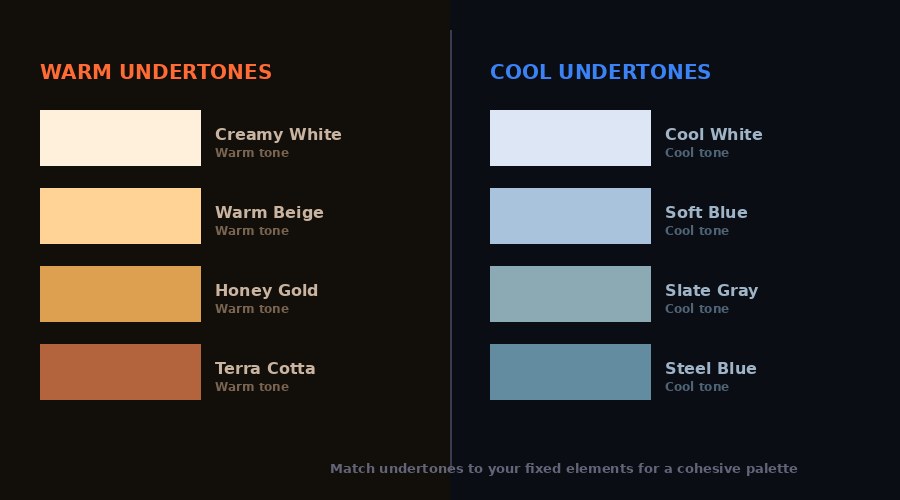
Step 2: Understand Undertones — The Most Misunderstood Concept in Paint
Here’s the single most important lesson we can give you: every paint color has an undertone, and that undertone is what causes colors to look completely different in your home than they did in the store.
A color called "Soft White" might have undertones of blue, green, pink, or yellow — and you usually won’t see it under store lighting. What looks crisp and clean in the showroom can look dingy, greenish, or downright pink on your walls at home, depending on your light sources and adjacent surfaces.
Warm undertones (yellows, oranges, pinks) work beautifully with wood floors, warm stone, and earthy tile. They create cozy, inviting spaces. Cool undertones (blues, greens, grays) pair naturally with cool stone, gray tile, and stainless fixtures. They create calm, contemporary spaces. When warm and cool undertones clash in the same room, the result looks "off" in a way that’s hard to diagnose — the room just doesn’t feel right.
The fix is simple: always sample in your actual room, under your actual light, before committing.
Step 3: Use the 60-30-10 Design Rule
The 60-30-10 rule is the foundational tool of every professional interior designer, and it works because it mirrors how the eye naturally moves through a room. Here’s how it works:
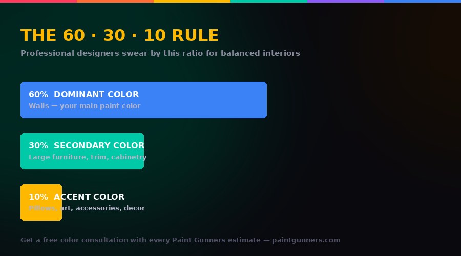
60% — Dominant Color: This is your wall color. It sets the overall tone and mood of the space. It should be the most subdued of your three choices — a saturated, bold wall color is hard to live with long-term.
30% — Secondary Color: This appears on large furnishings, trim, cabinetry, or an upholstered sofa. It should complement the dominant color while adding visual interest. This is often where you can be bolder.
10% — Accent Color: Pillows, art, vases, throw blankets, lamp shades. This is where you bring in a punch of personality — and it’s the easiest element to change if you tire of it.
When choosing your wall color, think about what 30% and 10% you’ll be pairing it with. A sage green wall might pair beautifully with warm wood furniture (30%) and terracotta accents (10%). The wall color doesn’t exist in isolation.
Step 4: Consider the Light in Every Room
Light is the single biggest variable in how paint looks, and it changes throughout the day. North-facing rooms in the Pacific Northwest receive cool, indirect light and almost no direct sunlight — colors here will look cooler and more subdued than the chip suggests. You generally need to go warmer to compensate.
South-facing rooms receive warm, bright light for most of the day — colors here will look lighter and more vibrant. You can often go cooler or more saturated. East-facing rooms have warm morning light and cool afternoon light. West-facing rooms are the reverse.
Seattle’s overcast climate deserves special mention: our diffuse gray light is very different from what paint chips are photographed under. Colors tend to look flatter and cooler on most days. This is one reason warm whites and soft neutrals are so popular in Pacific Northwest homes — they add warmth that the natural light doesn’t always provide.
Step 5: Sample Correctly — This Step Is Non-Negotiable

Never make a final color decision from a 2x2 inch paint chip. That chip is too small, too isolated, and looked at under the wrong light. Here’s the only reliable sampling method:
Purchase quarts of your top two or three choices — most brands charge $5–$12 per quart, and it’s the best money you’ll spend in the whole project. Paint large swatches — minimum 12 by 12 inches, ideally larger — directly on the wall in the room where you’ll be using the color. Not on white cardboard. On the actual wall, which may have existing color bleeding through.
Then live with those samples for at least 48 hours. Look at them in the morning when you wake up. Look at them at noon with natural light. Look at them in the evening under your artificial lighting. Look at them when it’s overcast and when it’s sunny. See what happens to the undertones throughout the day.
Hold each sample next to your flooring, your countertop, your largest piece of furniture. Only after seeing a color in your actual environment, under your actual light, with your actual fixtures, are you ready to decide.
Popular Color Choices for Western Washington Homes
While color choice is deeply personal, certain palettes consistently perform well in Pacific Northwest homes. Warm whites and off-whites like Sherwin-Williams’ Alabaster (SW 7008) and Benjamin Moore’s White Dove (OC-17) are perennially popular because they add warmth to our often-gray natural light. Soft blue-greens like Sea Salt (SW 6204) and Palladian Blue (BM HC-144) feel clean and calming, and pair naturally with the PNW’s water-and-forest landscape. Deep charcoals and navy blues have become increasingly popular as accent walls and exterior colors, giving homes a bold, contemporary edge.
For exteriors specifically, white and light gray bodies with dark trim are classic in the Seattle area. Deep forest greens and charcoal blues are gaining significant popularity as homeowners move away from traditional beige and cream.
When to Call a Professional Color Consultant
Color selection is a skill that takes experience to develop. If you’ve sampled multiple colors and none are landing correctly, or if you’re trying to coordinate colors across multiple connected rooms, a professional consultation can save you significant time, money, and frustration.
Every estimate from Paint Gunners includes a complimentary color consultation. We’ll walk your home, assess your light and fixed elements, and help you narrow down to two or three smart choices before you spend a dollar on paint. It’s one of the most valued parts of our service — clients consistently tell us it was the most helpful hour of the entire project.
Quick Reference: Color Choosing Checklist
- Photograph all fixed elements (flooring, counters, tile, built-ins)
- Identify the dominant undertone in those fixed elements
- Choose a 60% (wall), 30% (furniture/trim), and 10% (accent) color framework
- Consider the light direction of each room
- Buy quarts and sample 12x12"+ swatches on the actual wall
- Observe samples over 48 hours in different light conditions
- Make your final decision in the room, not at the hardware store
Choosing paint colors doesn’t have to be stressful when you follow a system. Our team is ready to help — whether that’s a free consultation at your home or simply answering questions about your specific space. Request your free estimate and color consultation today.